The short answer here is: no, wall art doesn’t have to match, and you should display whatever makes you truly happy. There are no hard and fast rules. Choose pieces that speak to you. If you want to mix purple and red, do it. If you want to install contemporary wall sculptures around a family heirloom painting to give it a modern flare, why not? If you want to add a pop of lime green to your monochromatic dining area, we support you. If you want to introduce a contemporary piece into your modern farmhouse, go for it. Art is an expression, and there are no right or wrong ways to enjoy pieces that stand out to you. There are no boundaries when it comes to making your home the place you enjoy the most.
We heard the word “happy” from so many of our collectors amid the pandemic when many were spending much more time at home than usual. “This piece makes me happy when I drink my morning coffee.” “Every day, I pass my garden and your sculpture brings me pure joy.” That’s what our handmade art pieces are all about! Creating everyday moments for our collectors to savor is on Jon’s mind during the design process.
We are always here to support you, and are often asked for feedback and guidance. We are happy to help, and without crossing into the territory of designers, we will seek to understand your goals and provide options that we thing would be suit your space with regard to color, size, spacing, etc.
As we do speak to so many of you, and see hundreds and hundreds of photos of your homes, we can tell you with certitude that if you don’t feel the flare for the bold and don’t have a burning desire to mix and match, you aren’t alone by any means. A large number of our collectors love coordinating, and they do it well! Their pillows tie in with their rugs, and throw pillows, and wall art is simply an extension of that grander theme or motif. They work with three to four colors maximum throughout their homes, or they have a specific pattern or graphical style they gravitate towards and carefully select pieces within their theme. There is nothing wrong with this approach, and it is a very common and straightforward way to decorate. Here are some of our favorite coordinating rooms:


We see it all. Many use our pieces as a bridge, a transition between styles. Some of our pieces work in mid-century modern purist’s dreams, straight out of the pages of a magazine. We’re at home in high-end contemporary homes, sleek monochromatic minimalist’s urban lofts, shabby chic cottages, cozy coastal homes, beachside villas, rustic retreats, simple county cottages, modern farmhouse, western ranches, and everything in between. There is a color, a style, and a piece of ours that can work anywhere and we never stop being inspired by everything you do with out pieces in your incredible settings!
MIX AND MATCH
Many of our pieces are well-suited to mix and match by design. We try to make it easy to incorporate more than one color, pattern, or feeling in a very digestible and simple way. We try to give you elements to create a larger installation that is uniquely yours.
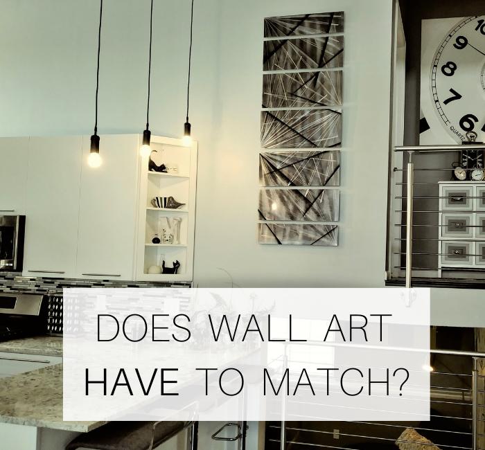
A piece like “Divided Unison” does the work for you. The mixing is built in! Here, you’re working with all silver pieces which would complement nearly anyone’s decor, but the distinct patterns create a more fun, whimsical, and unique feeling.
There are so many other ways you can mix and match our pieces. For example, purchase three sets of “4 Squares” in different colors and create a larger installation. “4 Squares Blue”, 4 “Squares Aqua” and “4 Squares Silver” look incredible together.
- Take a silver artwork piece and flank it with colorful wall sculptures.
- Create an installation of colorful wall waves.
- Create an installation of wall clocks that results in a unique feature wall.
- Create a sculpture garden with various shapes, sizes, and colors.
There are no bounds to what is possible with our pieces.
A WORD ON ECLECTIC STYLE IN A BROADER SENSE
More than mixing and matching, truly “eclectic” interior design is a style in and of itself. Eclectic design doesn’t mean your space consists of a random hodgepodge of pieces with no clear relationship. Rather, it can be an intentional and very carefully cultivated interior design style that features unique art of features like fixtures, mixing old and new, using an unexpected material or feature item. It can extend to intentionally celebrating and highlighting contrasts, and putting an emphasis on handmade, original, one of a kind items. An eclectic design isn’t one that means “anything can go”. It takes an understanding of many design principals to pull off eclectic well. Think of “Eclectic” décor as taking from several well-defined styles, or gathering elements that work well together. Textures, colors, patterns , materials, scale and other elements can be a theme that ties the look together and creates a sense of harmony.

An unexpected mixture of styles works well! A unique feature wall created with metal also houses a handmade original metal wall art composition. The two pieces aren’t in conflict, and they work well with the grand, gothic light fixture (not captured in this photo) and bespoke feature stair railing. There is a mixture of colors, and shapes, and the space is peppered with unexpected choices, but the area looks very well pulled together, and everything is well-sized for the space.

Bright, beautiful pink and red pop. The texturized black metal sculpture provides a distinctive contrast, and this unexpected pairing works.

This is an expert mixing of textures. The floor is traditional, and a brighter, more contemporary wood tone. The wall has a gorgeous patina effect that is evocative of time passing. The feature wall art is crisp and contemporary, and does an amazing job of complementing both tones in the floor and wall. Even the playful and subtle texture seen in the night stand is a key part of all of these pieces flowing well together.

This moody room features eggplant walls, velvet seating, a traditional fireplace and side tables, and a deco-era lighting fixture. Though the lime green wall clock and chairs tie in together, this is an eclectic room that functions well. The green trim pops when the natural light from the oversized windows pours in.

Here we have wood paneling as a focal point, with a mixture of earthy textures on the table. Bold paintings of different eras and styles flank the television. Our wall twists in blue and purple add a modern pop. The oversized grandfather clock is taking it all in from the corner, and there is no doubt this collector loves their space and carefully chose each piece with care.

Here we have a graphical, Asian-inspired piece taking center stage with two contemporary wall art sculptures creating a larger, mixed-media type installation. The pieces, as different as they are, both have prominent textural elements in their own respects.

Lori’s home is largely mid-century. It is evidenced in her dining table, the hints of breezeblock, and light walnut in the kitchen. Eclectic starts to become apparent when you take in the contemporary light fixtures, concrete-like floors, and our contemporary wall art as a focal point.


Leave a comment
All comments are moderated before being published.
This site is protected by hCaptcha and the hCaptcha Privacy Policy and Terms of Service apply.